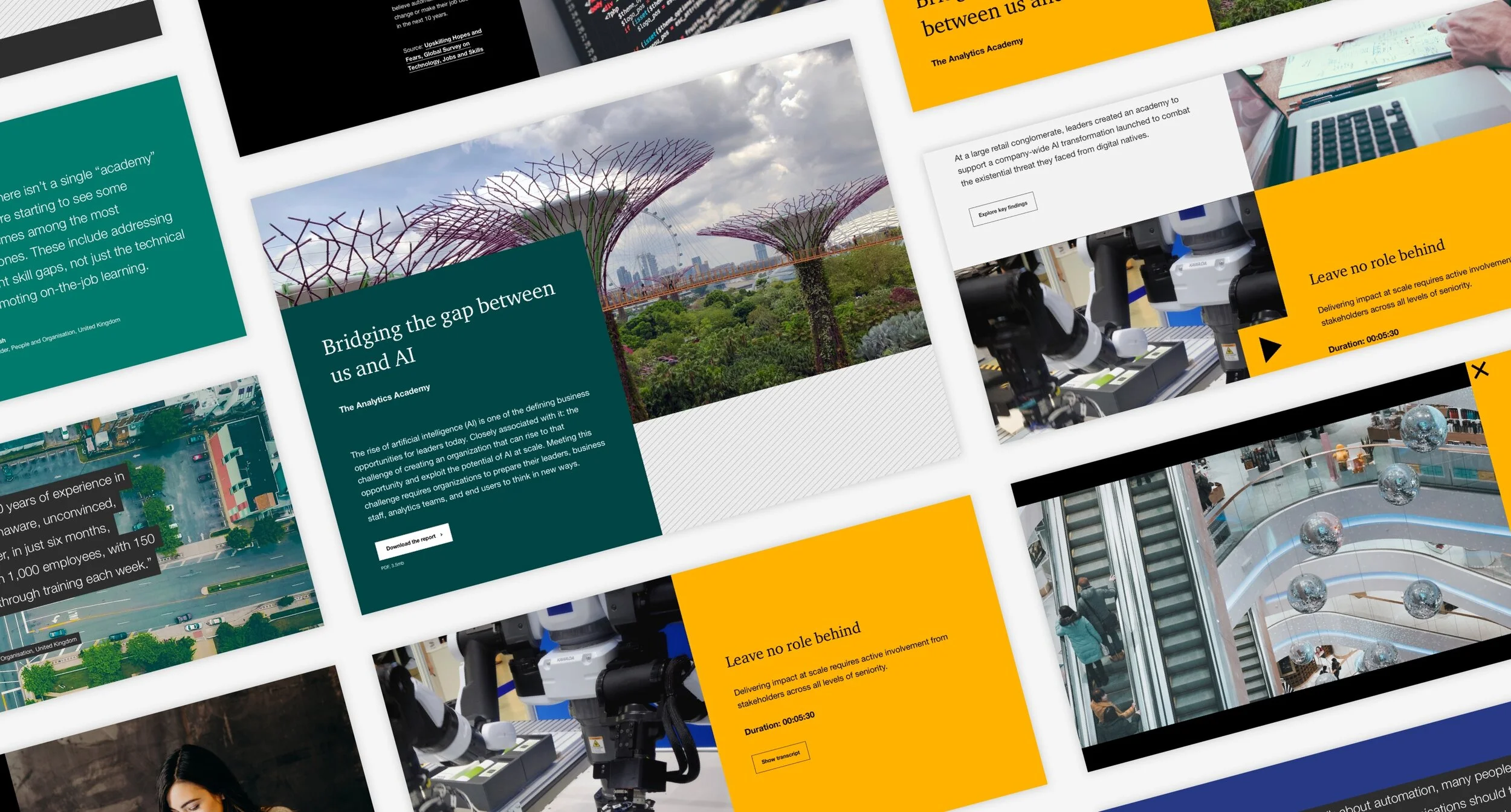
A customisable super hero
As part of our management of the online design systems for an international professional services firm we would often receive requests for new components from different territories and services. A common request we would receive would be for bespoke header components, specifically for campaign pages and other important content.
Our challenge was to design and build a new ‘super hero’ header component that would give campaigns a more high end first impression without creating a disconnect with the existing web components.
Client: Top 4 professional services firm
Agency: TheTin
Date: 2018-2019
Role: Lead UX/UI designer
Team: Head of Design, Designer, Front End Developer and Project Manager
Tools: Sketch, Invision and Google Docs
The approach
Another designer had created rough concepts to present different options to the client so my first task was to audit existing campaign pages to figure out what the common elements were and see if we could form a solid recommendation around one of the concepts.
I created block wireframes of each example campaign to find commonalities in the types of content, the order on the page and the rough layout. I focused only on the introductory content at the top of the page before the main content area.
The result of this was a small list of common components that would need to be designed; hero options, text and image, video, stat bar, and quote.
Because there is a lot of scope for variation in campaign pages the super hero would have to be fully customisable in terms of which components to use and which order they should be positioned in. This task enabled us to recommend the 50/50 modular approach that would give content authors more layout flexibility.
The solution
As the UI of the recommended concept was quite detailed the solution was already in sight. My role was to make sure that this approach would work with the client’s requirements, flesh out the UI, create the mobile version and work collaboratively with the lead front end developer to make sure the concept worked at all break points and to provide thorough build and authoring guidelines to the client’s internal IT and content teams.
The 50/50, modular styling on desktop and large tablets helped to make sure there was consistency across campaigns however the content authors chose to customise them. On smaller devices the 50/50 layout wouldn’t work so I designed a bespoke responsive solution for each element within the super hero component.
To bring this modular layout to life I worked with the front end developer to explore and test motion and interactions within each element. For example, in the hero component the background image pins while the text content scrolls over it.
Reflections
The super hero, in its beta stage, was tested on one of the client’s annual global campaigns. A couple of weeks after launch the client reported that downloads of the survey PDF had increased by 100% and conversions increased by 38.5%. These positive results helped to inform our approach to other projects for this client and validated the UX process.
These analytics and additional user feedback helped us to develop the super hero further for a phase two release.


