HLB International
HLB International is a professional services company that is comprised of individual member firms all around the world. As these firms are separate companies they each retain their own visual identity with varying levels of co-branding to highlight their membership to HLB. Across territories member firms had also grouped together to form their own regional sites. This means that the value of the HLB name isn’t conveyed clearly and consistently to clients.
The challenge was to bring HLB’s new visual identity to life online for the global site to such a high standard that members would want to adopt it for themselves.
Client: HLB International
Agency: TheTin
Date: 2018
Role: Lead UX/UI designer
Team: Head of Design, Designer, Strategist, Developer and Project Manager
Tools: Sketch, Invision and Photoshop
The approach
Having spent many years producing work for another global professional services firm, as an agency, we felt we could add a lot of value to HLB. To understand their particular user needs and business goals, however, we held a workshop with the client and developed several personas with them. These personas were representative of users at different levels within the industry; not just from the c-suite.
Once these were signed off I developed a number of user journeys for each persona to explore how users represented by each one could achieve their goals while using the global site. Their goals ranged from a Head of Operations looking for a new service provider to an existing client seeking to expand their business to different markets.
During this user journey phase I highlighted key areas of the site that would benefit from more extensive change rather than a simple reskin. These included:
Streamlining the primary navigation.
Providing contact information for service level and industry experts across territories.
Promoting campaigns and thought leadership from within the network to reinforce the firm’s expertise to prospective clients.
These user journeys were crucial for building empathy with users as they helped us to target pain points within the current site and explore ways to improve the experience. They were also extremely useful in making sure there was collaboration between us and the client from the very beginning. It opened up our processes to the client and laid the groundwork for any changes that we would recommend making before jumping into the creative stage.
I presented these to the client referring back to the personas so that it was clear that each recommendation solved a user need. This turned out to be a good approach as the client signed off on all recommendations apart from those that the business wasn’t structurally able to support.
All of the learnings from the user journey phase informed the creation of low-fidelity wireframes and a new site map. There were many overlapping pain points between personas, for example, it was difficult to find a direct contact for a specific service or territory, so I prioritised these issues and made sure to solve them in the wireframes. Most of these issues were easily solved with better content organisation but some were reflections of the business structure and so were tabled for a future phase two.
I decided that low-fidelity wireframes would be the best approach because there wasn’t enough guidance for digital application in the new visual identity. Exploration would be needed further down the line so it would have been a mistake to get too specific in the wireframes.
It’s often the case that visual identities are not created digital first; although this is slowly starting to change. Brand guidelines may get signed off without providing detail on motion, use of space, accessibility and so on. After discussing this with the client they agreed that a digital exploration phase was needed.
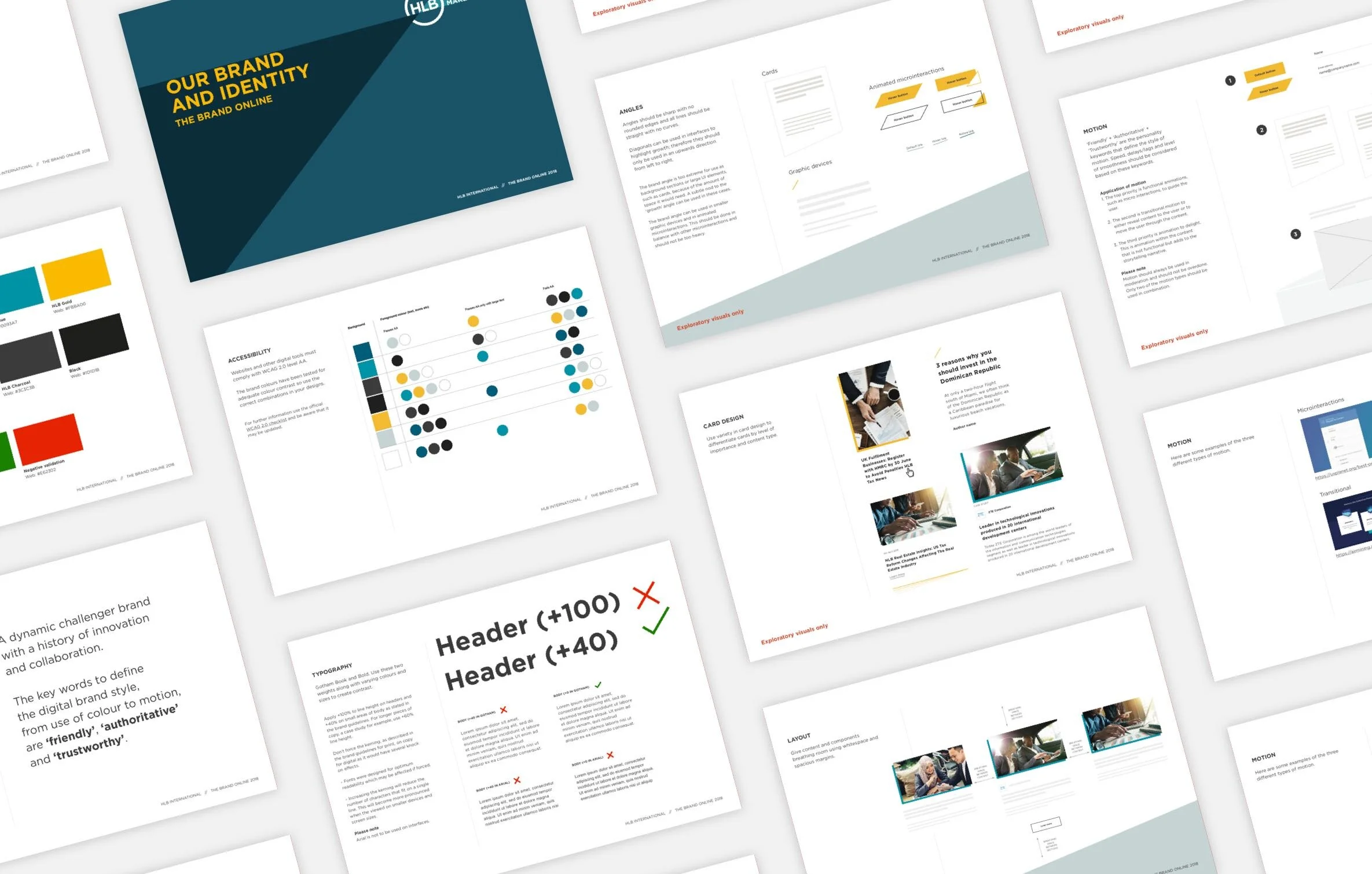
After looking at how the brand could apply to various UI elements I developed an Invision board with a series of digital principles. These are a few examples:
Application of colour to be consistent, accessible to level AA compliance and to limit the brighter colours to accents and interactions.
Reduced the forced tracking for web typography as defined by the brand guidelines.
Defined the use of angles within the UI so that the key principles of the visual identity are consistently applied.
Micro interactions and motion should always be directional and point to the top right of any canvas to highlight growth and success.
This phase was really beneficial for the client as they could start to see how elements of the website would look without having invested too much of the budgeted design time. Beyond that they could also see how the principles could benefit other areas of the business and they asked for them to be reproduced in a format that could be distributed to the entire network.
After completing the exploration phase the UI design came together more smoothly as much of the thinking had already been done and signed off by the client. The digital principles became a very useful onboarding tool as I was able to split the interface design with another designer and provide creative oversight.
The solution
The end result is a modern, accessible and spacious interface that pushes the visual identity to work harder online.
Reflections
The project highlighted the benefits of creating digital brand principles to fill the gaps in visual identities that were not created ‘digital first’. This phase allowed the clients to collaborate as they could see both the development required to translate the wireframes to the final UI as well as the potential for adding value to their new visual identity.


